ChoiceLight, Inc. is a fiber infrastructure nonprofit company based in South Bend, Indiana. They provide and lease "dark fiber" to over 250 businesses and organizations in the South Bend - Elkhart region. These subscribers then "light" their fiber themselves or partner with an Internet provider of their choosing. The network's extensive reach of over 500 miles, designed with an underground concentric ring layout for reliability, connects vital commercial, educational, medical, and governmental hubs.
1
Problem Statement
Focus Group
2
Persona
User Flow
3
Paper Prototype
4
3 Pain Points
3 Solutions
5
Impacts
Lessons Learned
Future Considerations
Research
What was the problem?
ChoiceLight was unhappy with how the current design of their website was:

"The website is too plain"

"We found it difficult for subscribers (customers) to navigate."

The website didn't adhere to their brand guidelines of Professionalism, Localness, and Innovation. So, I decided next to research into the specific issues that the website was giving ChoiceLight and its subscribers.
Focus Group
In order to chart the optimal course for my redesign, I conducted a focus group session involving my colleagues. With the aim of gaining a holistic understanding of the user experience, I asked probing questions that delved into the heart of customer interactions with the ChoiceLight website.
From this discussion, some main tidbits emerged, shedding light on the user journey and highlighting the key areas where improvements were warranted.
Here are some comments I gathered during the focus group, highlighting where I should focus on improving the user journey:
Synthesis
Persona + User Flow
Conducting the focus group allowed me to understand the audience that I would be designing the website for. Using information gathered from it, I created a persona who would fit the description of a typical ChoiceLight subscriber.

Ideation
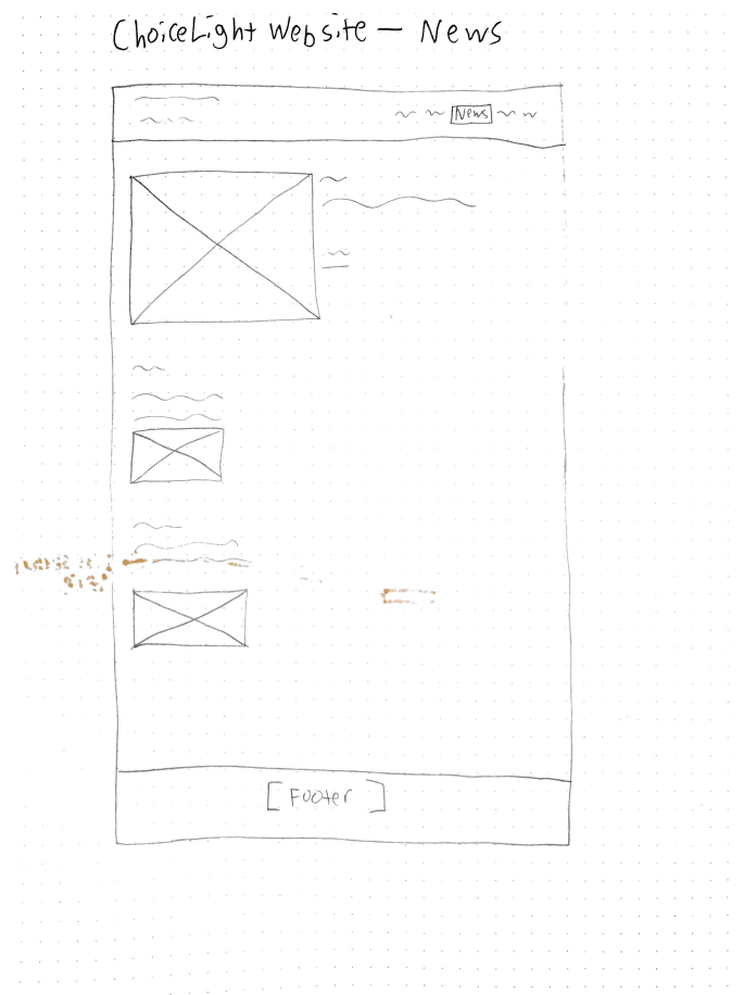
Paper Prototype
Next, creating a paper prototype of the redesign allowed me to visualize the website layout, test user experience elements, and gather early feedback from stakeholders to decide the direction I needed to go to discover the best results.


Pain Points and Solutions
Pain Point 1:
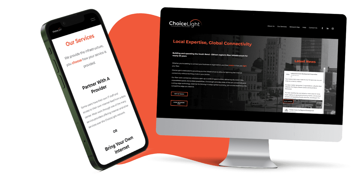
HOME PAGE
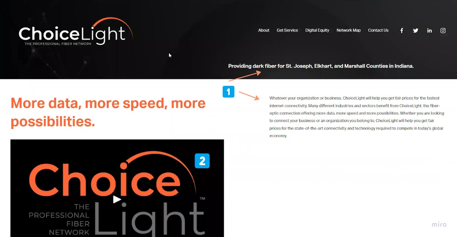
1️⃣ The old homepage didn't have a clear place to start from, as the hierarchy of information is confusing.
2️⃣ There is a two minute introductory video to what ChoiceLight is. People will not take time to sit through this.

Pain Point 2:
NAVIGATION
One of the biggest issues the team had with how navigation worked is that they would get unnecessary calls from potential customers asking if ChoiceLight provides internet service. This is not the case. Customers would think that "Get Service" meant "get internet service".

SOLUTION 2:

Pain Point 3:
CONTACT PAGE
1️⃣ This button doesn't necessarily take you to a page to report an issue. It takes you to a guide to help fix issues yourself.
2️⃣ Although it's a contact page, it didn't feel personal, which runs contrary to the theme of ChoiceLight being "local". To them, local means that you can get to know ChoiceLight. They aren't just a faceless corporation.


Reflection
Impacts
After making these changes, I informally showed it to my coworkers, who loved it. There were also 40% less calls to the emergency hotline number, and a higher satisfaction with users of the website.
While I didn't test the website with users, if I were to, I would design a usability test with tasks that tested the main features of the website, such as finding the network map and reading the steps to fix your fiber connection.
Lessons Learned
Future Considerations