Indiana Disability Resource Finder
Usability test and redesign for the Indiana Disability Resource Finder website
The Indiana Disability Resource Finder is an online platform that provides information and resources for individuals with disabilities, their families, and caregivers in the state of Indiana. The resource finder is designed to help individuals locate and access services, programs, and resources that can assist them in managing their disability and achieving their goals.
Purpose
Methodology
Tasks
Results
Design
7 Pain Points
7 Solutions
Conclusion
Next Steps
Lessons Learned


Methodology
WHAT we tested
WHO we tested
3 participants:
• Male, 35, scientist, 5 (extremely comfortable) with websites, has never used testing website before
• Female, 26, software engineer, 5 (extremely comfortable) with websites and technology, has never participated in usability testing before
• Female, 21, Vet Assistance, 4 (very comfortable) with technology, has had a usability test before
WHERE we tested
Our usability testing was conducted via Zoom
WHEN we tested
User testing occurred from April 22 to April 23, 2023.
HOW we tested
Each test was conducted one-on-one, and generally lasted one hour.
Tasks
The main questions asked were split up into three scenarios, each having between 3 to 5 tasks. Each scenario’s tasks were based around typical actions that these user groups would perform.
A full list of the tasks can be found in the report.
These tasks included testing the website’s search features, events page, and listings. After each task, participants were asked their overall thoughts after completing the task. They were also asked to give them an ease of use rating, 1 (very hard) to 5 (very easy).
After all tasks were completed, participants were asked to give their thoughts about the website overall, rating the website on a scale from 1 (extremely negative) to 10 (extremely positive). They were also asked to rate the ease of use for the website as a whole, ranging from 1 (very hard) to 5 (very easy).
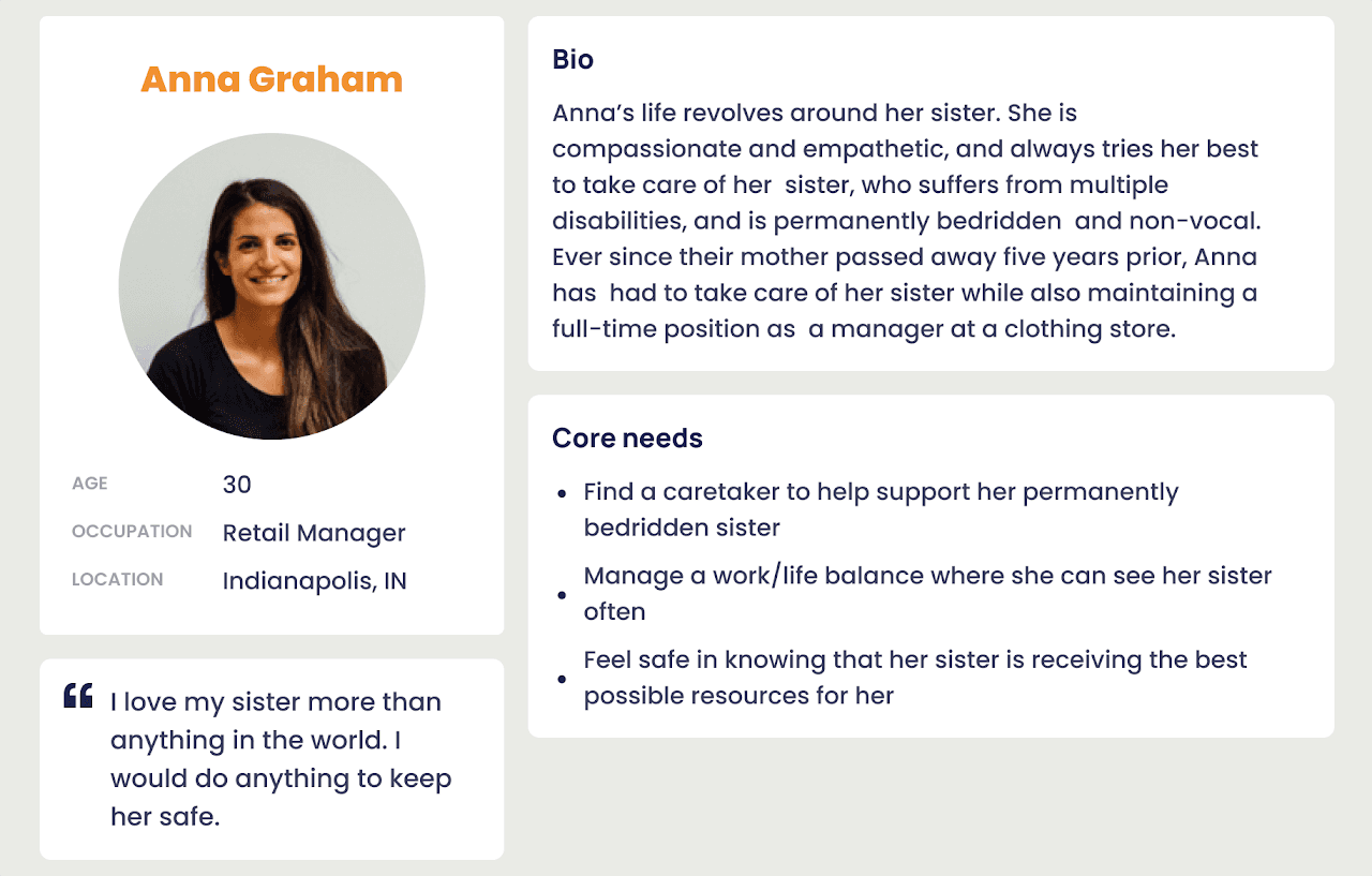
Personas for the tasks
The tasks were based around these three personas, identified through research into the user base of the website
Scenario 1 - Caregivers of Individuals with Disabilities
Scenario 2 - Individuals with Disabilities

Scenario 3 - Disability Advocates and Organizations

General Feedback


Average ease of use rating per task
Pain Point 1: Filter function in the search page
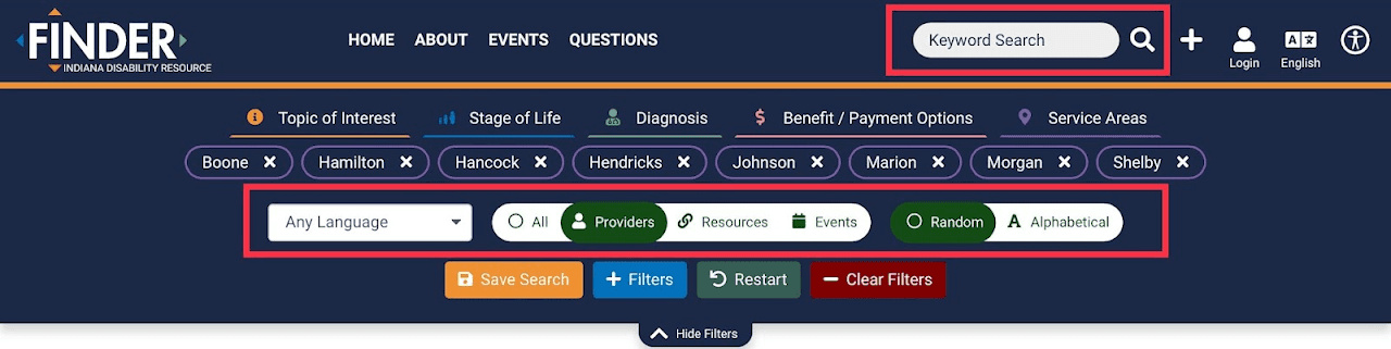
Filter function in the searching page.
Recommendations


Recommended redesign
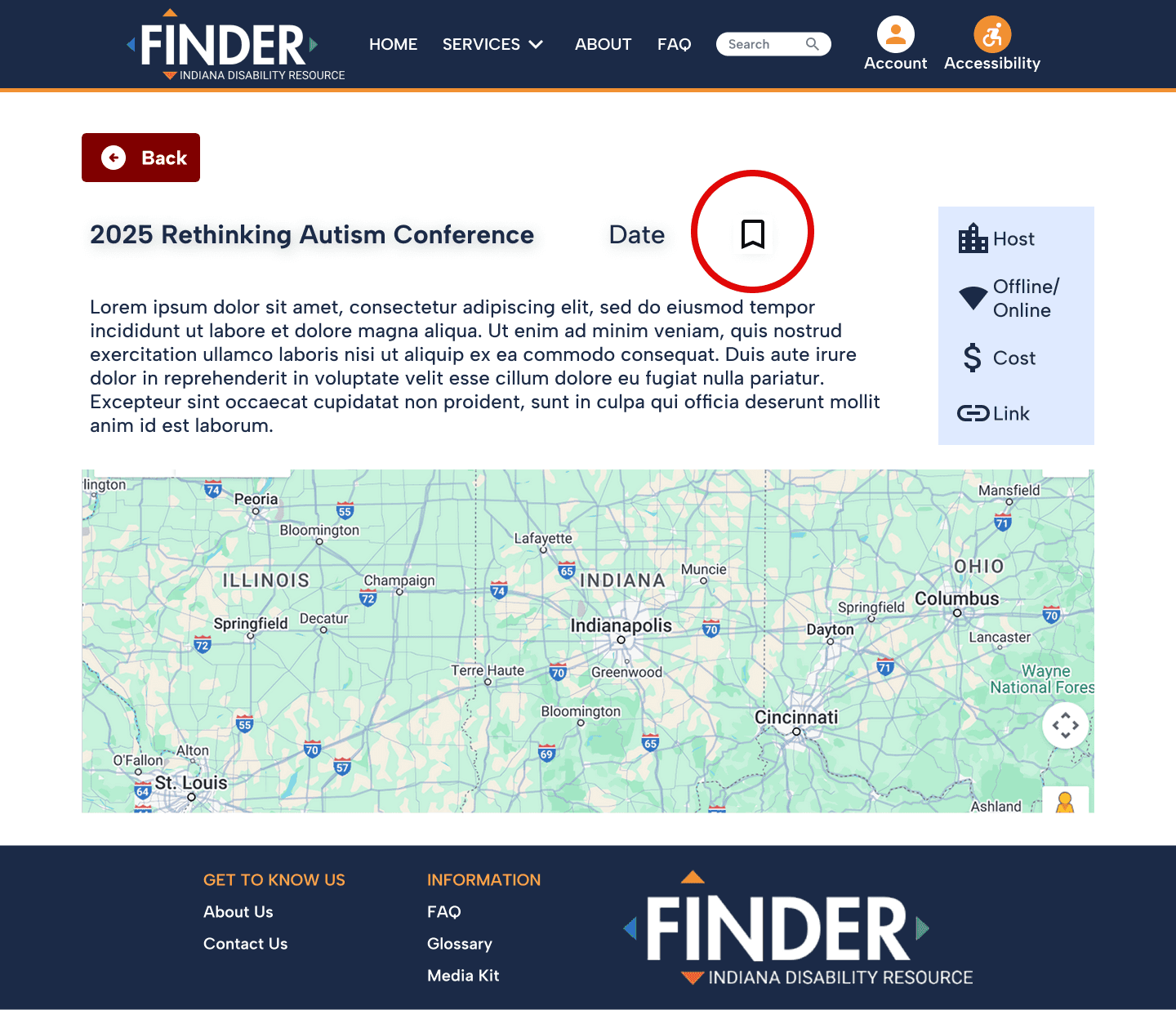
Pain Point 2: Finding and adding saved events
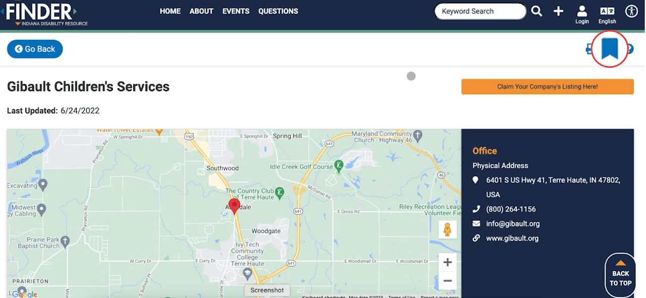
Bookmark button was difficult to find
Recommendations


Recommended redesign
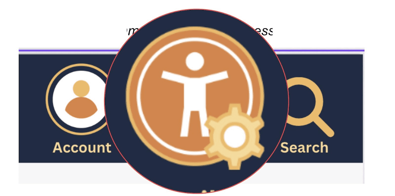
Pain Point 3: Identifying and using the accessibility tool

Accessibility icon
Recommendations

Recommended redesign
Pain Point 4: Finding info about support groups
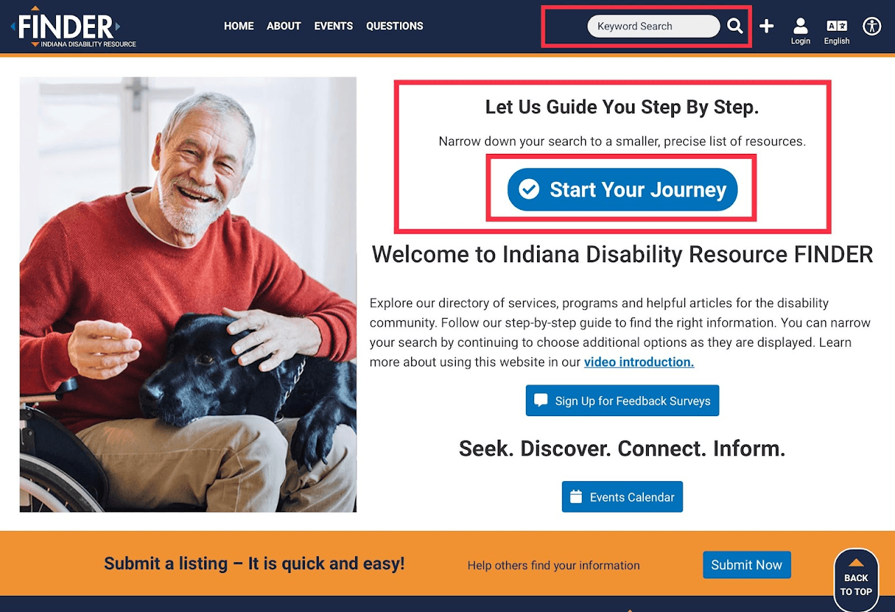
Homepage layout and priority call-to-actions/Functions.
Recommendations


Recommended redesign
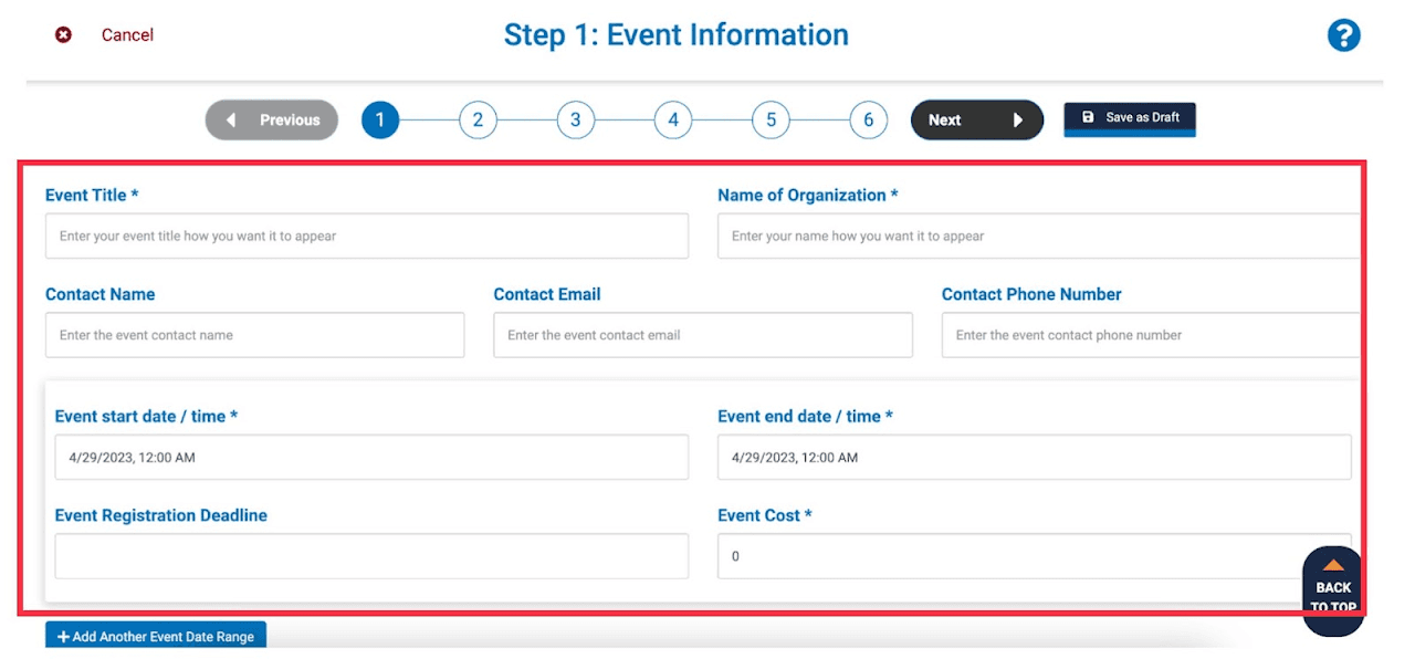
Pain Point 5: Filling out listing event information
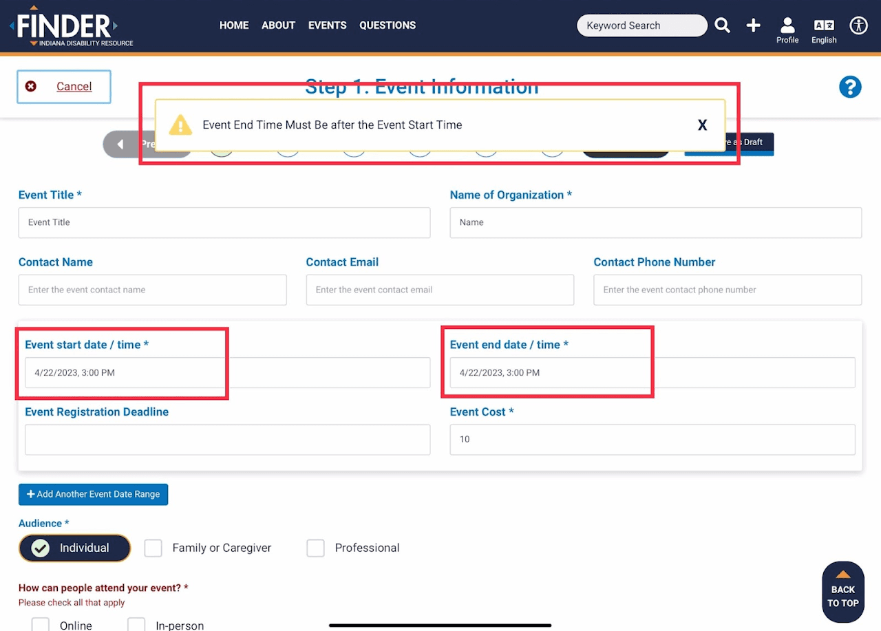
Recommendations
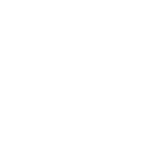


Recommended redesign
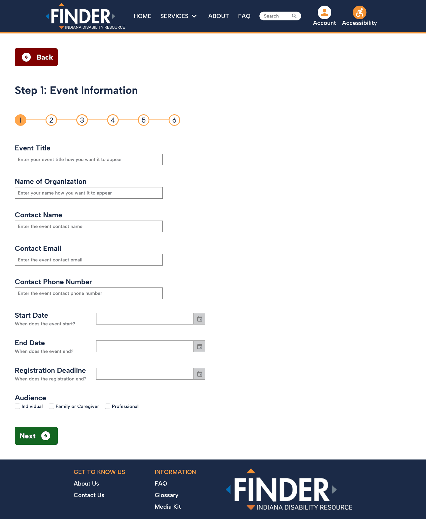
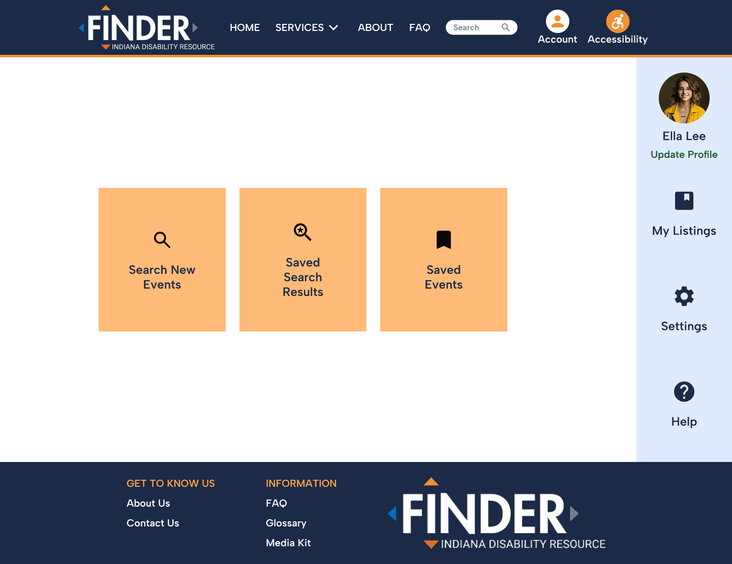
Pain Point 6: Finding event listing draft on profile page
User’s profile page options, settings, resources, other, etc.
Recommendations


Recommended redesign
Pain Point 7: "Submit Now" Button Placement


Example of the repetitiveness of the “submit now” footer asset while have already clicked the “submit now” button on the first screen capture.
Recommendations


Recommended redesign
Conclusion
In conducting this usability test, we hope to improve the Indiana Disability Resource Finder website's usability and user experience and ensure that it meets the needs of its targeted users.
Next Steps
• Given time to continue the project, we would look to either recruiting the same test participants or new ones, and create the same tasks as conducted in this study.
• We would then compile participant task data and compare between the old and new design, with metrics such as time on task, error rate, and self-ratings such as ease of use.
Lessons Learned
• Data is beautiful. Keeping observable data about the feelings that participants experienced helps in ensuring the most important areas of focus in a potential redesign.
• Scheduling and planning is vital. As our team was remote, we set up a calendar for when we were testing our participants and the different tasks that each member was designated to complete. I believe this was vital to our successfulness of this project.