Divoom App Redesign
Redesign for an app that allows users to display animated pixel art on a Pixoo device
The Company
Divoom International is a company specializing in innovative audio products and pixel art gadgets. Founded in 2006 by music enthusiasts, Divoom combines aesthetic design with high-quality sound, offering products like portable speakers and unique pixel art items such as the Pixoo.
The Product
The Divoom Pixoo is a pixel art picture frame. Users can change what is displayed through its app “Divoom: pixel art editor”.
The frame can display any artwork in its window, which there are three main models: 16x16, 32x32, and 64x64. It also has a variety of features such as a wall clock, music visualizer, and weather.
Users can also create their own artwork and upload it through the app and share their creations with others on the app.


Research
Review Analysis
User Research
Competitor Analysis
User Survey
Synthesis
Personas
Requirements
Ideation
Storyboard
Sketches
Prototype
Pain Points and Solutions
Testing
Review Analysis
I analyzed 50+ reviews on the Google Play Store to gather insights into the problems that users experienced with the app.
Despite having a 4.8 star rating on Google Play, positive and negative reviews overwhelming mention poor usability:

3 key issues to address:


Competitor Research
LaMetric is a smart clock similar to Divoom's Pixoo. It allows users access it through an app, controlling the clock faces and design through a pixelated display.


Sitemap
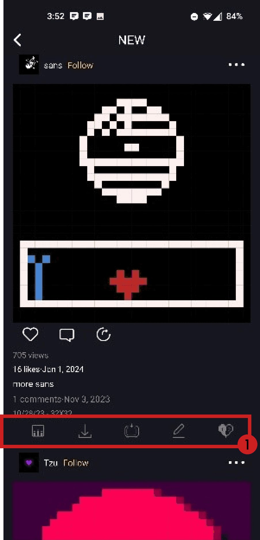
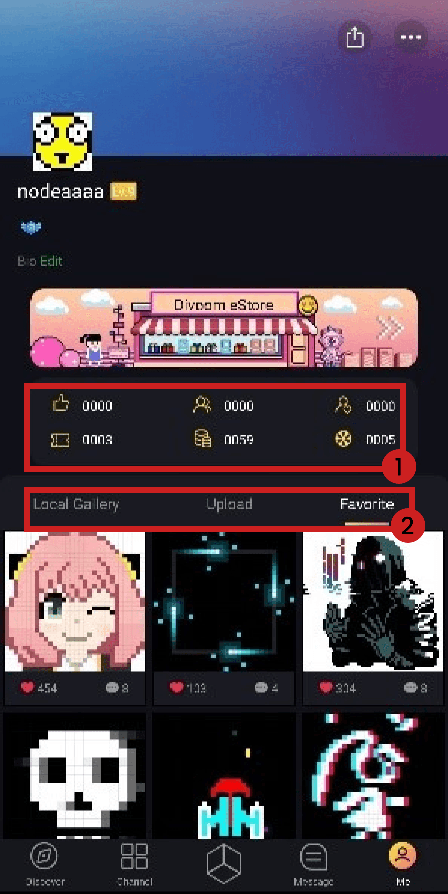
Here you can see my comments about some of the mislabeled, confusing, and/or redundant features contained within the app.
Storyboard

This example shows how the app could be used to display a birthday cake for a birthday party.
Initial Sketches

Main navigation tabs were consolidated and named appropriately.

Arrow used to indicate to user they can scroll search categories
Hamburger icon changed to filter icon and moved down to more appropriately fit context
Create button moved on screen, allowing the Explore icon not to disappear

Changed hierarchy of information to make the art piece title stand out, as well as views and likes
Moved unclear icons to artist brush icon

Tapping the brush icon takes the user to a menu. The original icons were too unclear just by looking, so I changed them to text (use as visualizer, etc).

Followers and Following numbers were changed as there was no indicator to what the numbers were before.
Changed “Favorite” to “Saved”, indicating that I have creations from others that are saved or liked.
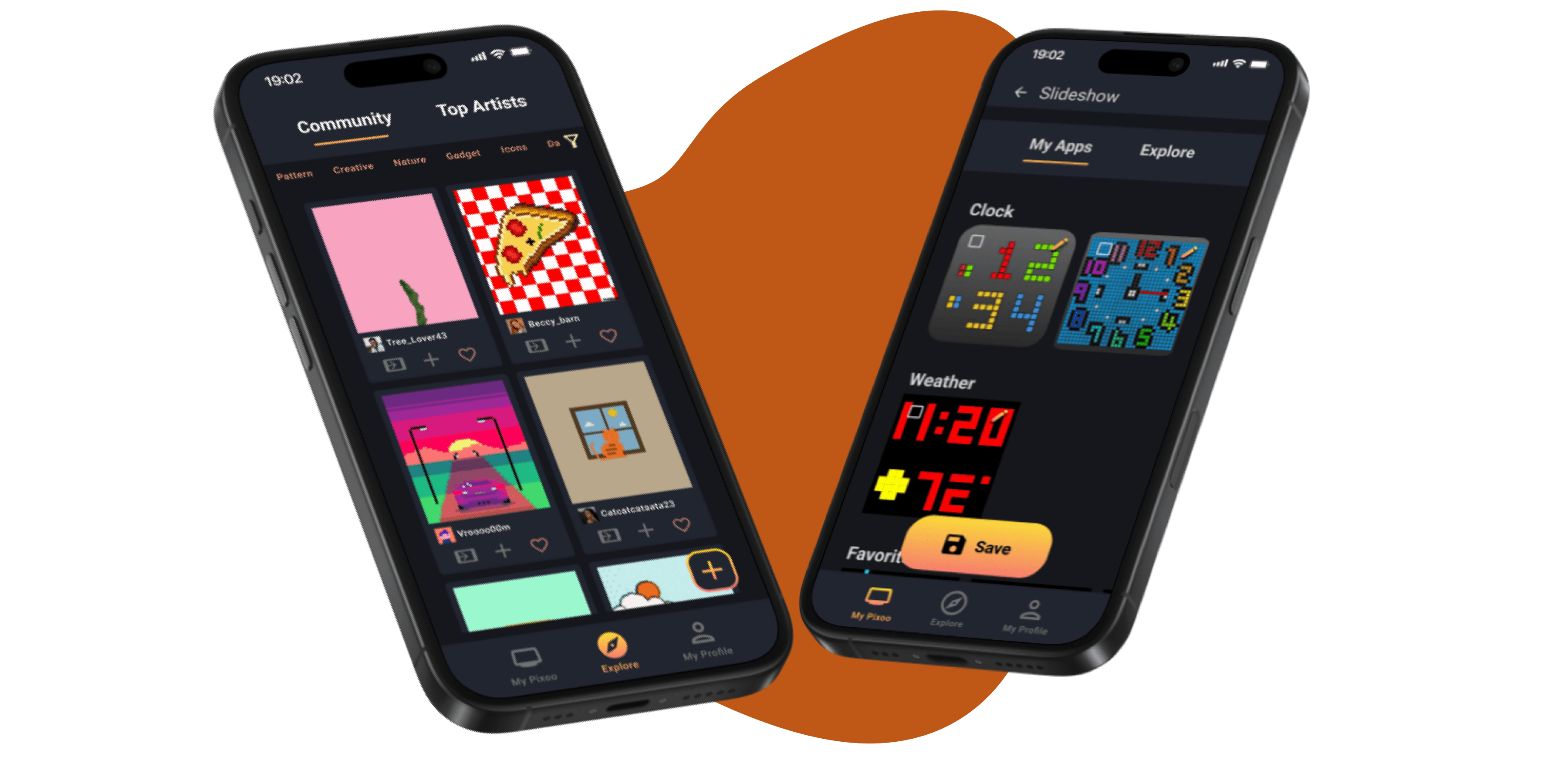
Exploring new designs for your Pixoo


Customizing an existing design

Viewing your profile page and liked designs

Viewing your Pixoo device and its features


Creating/customing a slideshow


Error recovery

Impacts
Upon testing the current app vs. my design with 5 users, I found:
Reflection
This type of app is more difficult to prototype due to its need of an external device. Next time I should assemble paper prototypes to act as screen for something such as the Pixoo device.
I couldn't recreate every single aspect of this app within the timeframe, as I concentrated on its main problems, but a lot more screens with logic could be developed.
Keep It Simple Stupid (KISS) are words to live by. Giving users less options to pick from helped them navigate easier.